May 12, 2010
May 3, 2010

April 28, 2010


April 21, 2010

April 19, 2010
NBA text
What
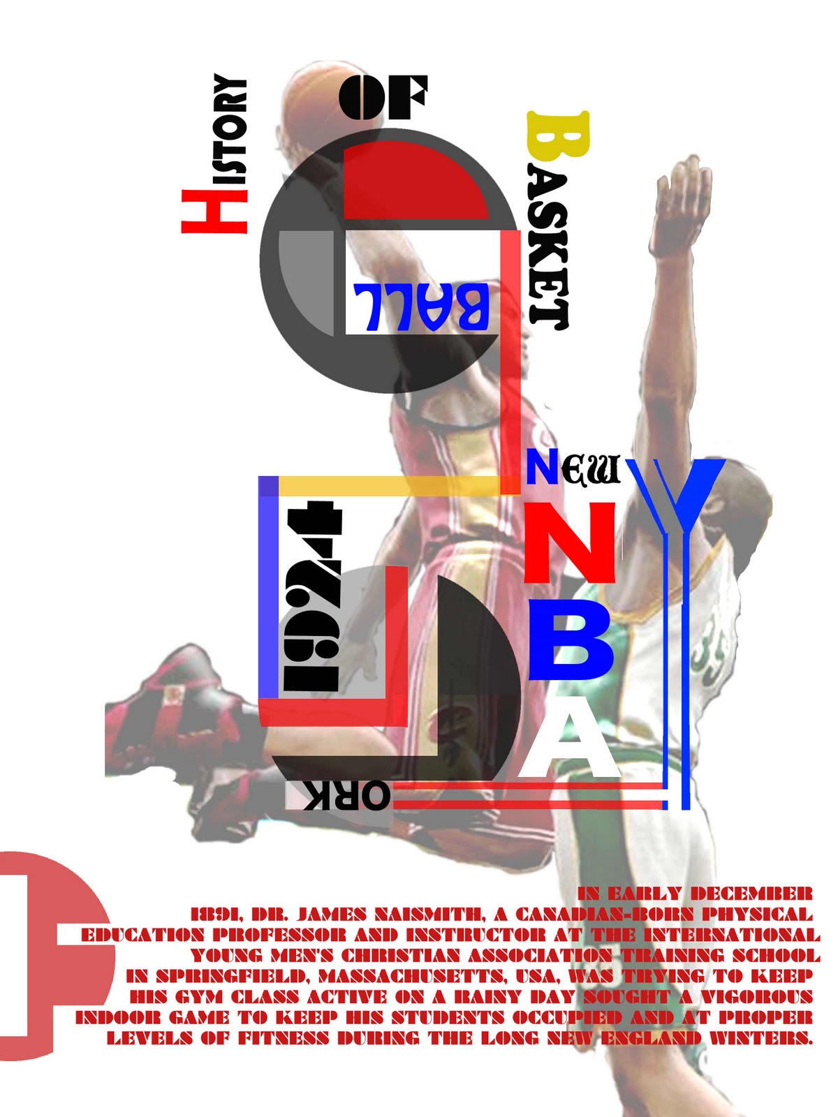
History of NBA
When
June 6, 1946
1940s: The BAA years
comprised of 11 teams
1960s: The Celtics Dynasty
dominated by the Boston Celtics
1970s: The NBA vs. the ABA
The American Basketball Association also succeeded in signing a number of major stars
1980s: Magic vs. Bird
That same year, rookies Larry Bird and Magic Johnson joined the Boston Celtics and Los Angeles Lakers respectively
1990s: The Jordan era
Michael Jordan entered the league in 1984 with the Chicago Bulls, providing an even more popular star to support growing interest in the league.
2010s
The 2010 All Star game was held at Cowboys Stadium in front of the largest crowd ever, 108,713.
Where
New York City started
How
The Basketball Association of America (BAA) is comprised of 11 teams in two divisions: Boston Celtics, Chicago Stags, Cleveland Rebels, Detroit Falcons, New York Knickerbockers, Philadelphia Warriors, Pittsburgh Ironmen, Providence Steamrollers, St Louis Bombers, Toronto and Washington Capitols
(29 USA, 1 Canada)
Most recent champion(s) Los Angeles Lakers (15th title)
Most championships Boston Celtics (17 titles)
April 12, 2010


March 31, 2010
Logo Fixed one
.jpg)
-.txt)
Alignment, Balance, Flow, Contrast, repetition, Emphasis.
I used flow to connect each pictures same as how I placed blue, green and red dots behind of General Catalog. Every words in the design spaced half inches from outline for balance of design. White color top of Red background makes letters and logo Emphasis. Color changing of Green, Red and Grey, desaturation, makes contrast each pictures in design. Its not much going on with repetition because if you using too much repetition it could make my design bored easliy. Only little part of repetition on the letter General Catalog for not getting boared. I tried use simple box shape on design for showing alignment and balance. Changing the shape of pictures are fun part of design, for me and hope for you. In my design, meaning is the relationship of BCC people. I use other colors and random placement of pictures and shapes to show they work well together. They "work well together" like a good relationship.
March 29, 2010
Project - 2 (#1 Essay)

In the critique, i needed to change size of logo bigger. So i changed the size of logo and replaced to other place because when i changed the size, it was not fit in the place where i used in first time. I need to put more pictures. I had only two pictures and i added one campus picture as background and one of a guy's picture. I connected each pictures to give a little bit of flow on the design. I also need to find the meaning of my design. I wanted to show to people that we are work hard, busy, but happy just like what New York people are do. I used red , blue, green color changes so make it smooth going in he design ,color changes was one of the needed changes for emphasis. Its works better after replace letters. I replaced and used other shape of letter for "This is your college" to the side to use more place in design , covered up the empty space. For the other hand i also replaced "general catalog" to use meaning of alignment in "General Catalog 2010-2012".

March 24, 2010


March 3, 2010

March 1, 2010

February 22, 2010
Essay(2)
My focal point of this picture is "Emp". I did not use all words of Emphasis because I want focus on the meaning of the words, not only using words. I also used the meaning of "Flow" in the picture by connection of first letter F. One thing I did not do is word "F" should go front of the words Repetition and Alignment. I used flow with meaning of word too. Not only the way of connected with "F" but also where they placed too. The word flow is placed everywhere, top, bottom, left, and right, in the picture. I used only six letters for Balance because even numbers are seems more balanced than odd numbers. I used symmetric skill for balance to make balanced. I placed four "Balance" and separated two turned Balance and two not turned Balance, even numbers. I also used the meaning of Balance in hole picture. I mostly used even numbers of using letter, four letters of Flow or fourteen raw of Repetition and Alignment. I saw many people used focal point with contrast but I used contrast as the color change of letters. Those black and white letters shows the meaning of Contrast in my picture. And I used colored letters one by one thoroughly to make balance. My last two words Alignment and Repetition go together in picture. I used Alignment in way how they settled, fourteen alignmently settled raw and how they indented in front of each words repetition. Using even numbers of letters can show Balanced picture, but also shows they are alignment. And the Repetition, I used Repetition to keep repetition letters alignment and repetition. I can see it just become a great picture by only using words in designable place, but I want to use meaning of the each words more than placement. It does not mean placement is not important but I though how using words is more important than where using words in this project.
February 15, 2010


Subscribe to:
Posts (Atom)